- Drop cap
- Image(s)
- Heading
- Sub heading
- Summary
- Banner
- Name
- Pun
- Page number
- Emotion/ adaption
- Same photo-shoot
- Credit
- Layer
- Color
- Recognizable style
Friday, 17 August 2012
Magazine Double Page Requirements
After looking at all my analysisng i have put together some of the main things required and consistent within a magazine

Conclusion On Double Page Spread
Conclusion On Double Page Spread
To begin with, to get an overview of constancies I analysed two magazine content pages from the same magazine (cover page) and now the double page spread and two at random to get an overview of double pages requirements.
Firstly, when I was analysing all of Q`s pages the main thing I did notice was the colour scheme being consistent, with the cover page it was red white and grey. The layout was very neat and basic yet very elegant with the sense of music incorporated into it. So when looking at tension and release, it would release a lot as its not hurting your eyes with loads of colour, it’s easy to look at and you see more of your celebrity and less text. There isn’t every any chaos dragging any attention away from anything, this same thing was consistent with the contents page. There was a lot of writing on the Q contents page, but the boxes and banners separated it in a neat non chaotic way, it was very well laid out. We see a picture of Matt, then we again see an image of him in the contents page, we see him in the cover page dressed very normal rock star and him going crazy wearing a silver jacket in the contents page, this is relevance to the main content of the article. There were other images included but this drew away the attention from too much text and created space. Then we look at the double page spread and we can see a very newspaper layout for the text, yet the attention is drawn away from the banner and the image of MUSE the band dressed in the same outfit as Matt was in the content’s page, so already we have consistencies. If you don’t have follow up images it’s just confusing on why there are so many different pictures. Otherwise it would create the impression that Q can’t organise a photo shoot and just got a load of images from the internet type of thing, the pictures are always relevant to the article. You wouldn’t have an image of Balmy Bellemy standing there completely still on the cover dressed in a suit, then have him sitting on the floor in front of the Canadian flag in the next image, an image paints a thousand words so the image has to be consistent as well as the text. The text was spread over a few pages but obviously I only needed two, so we can see that there’s a very big bold quote of ‘maybe I'm borderline schizophrenic’ is a very mental based quote, and the cover was about him going crazy so there’s linkage. In the interview questions based on that quote was asked, so again we can see a large amount of organisation within this article especially with layout.
This same concept applies with the Villie Valo Him Kerrang edition. The only lack of consistency was the fact the contents page was too basic to the extent I wouldn’t have looked at it unless I had to. So I will just compare the consistencies between the cover page and the double page as I don’t feel the contents page was a normal representation of Kerrang`s normal style. The image of Villie Valo was very basic, not in a negative way as it was very effective, it was him up close shot with smoke, and the image in the double page was with him with the exact same make up on. The image was a medium long shot; he was sat in his home with the rock star image style very relaxed. This was almost a representation of him overcoming drugs, the rock star underneath but a normally dressed person on top, showing how he has overcome everything type of way. The questions they asked him were very personal to show he was human in a sense, asking about his life and his struggles. The colour scheme was the same, even with the text as this was bordered by a green banner faded as a layer on top of the image, the makeup and black hair was consistent to the grey and black colour scheme featured. The layout was very simple however, again with an image of him close up and a very simple image and layout on the double page spread. Kerrang usually has a lot of shapes, banners and strap lines all over the place, however this double page spread was very Q like in the way there was layers of text underneath certain layers, the image was the biggest feature on the page and it was very neat. The contents page did include this particular theme (Q like consistencies) very basic, a lot of very neat images to draw attention away from the text. The image was very basic like the placement of everything. However, unlike Q, the photo-shoot for Villie was the same, the same image and same dressing was wore in each photo he is included in within this magazine.
This same concept applies with the Villie Valo Him Kerrang edition. The only lack of consistency was the fact the contents page was too basic to the extent I wouldn’t have looked at it unless I had to. So I will just compare the consistencies between the cover page and the double page as I don’t feel the contents page was a normal representation of Kerrang`s normal style. The image of Villie Valo was very basic, not in a negative way as it was very effective, it was him up close shot with smoke, and the image in the double page was with him with the exact same make up on. The image was a medium long shot; he was sat in his home with the rock star image style very relaxed. This was almost a representation of him overcoming drugs, the rock star underneath but a normally dressed person on top, showing how he has overcome everything type of way. The questions they asked him were very personal to show he was human in a sense, asking about his life and his struggles. The colour scheme was the same, even with the text as this was bordered by a green banner faded as a layer on top of the image, the makeup and black hair was consistent to the grey and black colour scheme featured. The layout was very simple however, again with an image of him close up and a very simple image and layout on the double page spread. Kerrang usually has a lot of shapes, banners and strap lines all over the place, however this double page spread was very Q like in the way there was layers of text underneath certain layers, the image was the biggest feature on the page and it was very neat. The contents page did include this particular theme (Q like consistencies) very basic, a lot of very neat images to draw attention away from the text. The image was very basic like the placement of everything. However, unlike Q, the photo-shoot for Villie was the same, the same image and same dressing was wore in each photo he is included in within this magazine.
Now, when we look at the other double pages I analysed we can see a very different style. Because I hope to create a very rock based magazine, I want to base it on Kerrang i.e. taking ideas from this magazine to base mine on. For this, I chose to analyse another double page spread, and for this one we can see the average Kerrang theme of chaos incorporated into the double page spread. The layout had a lot of shapes, a lot of informal language and was an interview with no seriousness, it was questions in which the fan wrote in, and Kerrang is a magazine which likes to get as close to the reader as possible, i.e. the letter from the editor the feedback page, Kerrang is always about the reader and not the money. Kerrang also like giving attention to the whole band and never follow the stigma of the singer getting the most attention, this is why there are a lot of images within this double page, an image of each band member and an image of the whole band to introduce you to the whole band. I mentioned before that it was very teenage girl wall like, it had a lot different fonts and it was bold and bright. As there was more than one person being interviewed it had to have indications on which person was talking, again this is more personal than interviewing one person as if everyone agrees on something its confirmed and you get more of an overview. There was a the follow of rule of three or four colour scheme, and the photography didn’t follow the rule of three as it was more profile portrait type of thing. This was a very humour based article and this was shown very much by the comments from the editor on the photo, the odd questions and the funny answers and a bunch of Emo smiling.
There wasn’t a lot to write about the Florence Q edition as it’s a very basic yet effective design. There are either two things Q magazine will do, they will either do a very magazine type of interview or they will make a very elegant double page with a textless image on one A4 piece, this normally has the purpose of being used as poster. This is a very mature article and this is accommodated for the fans of Florence, she has a very mature teenage fan base as she doesn’t really appeal to a lot of people under the age of 15. If this was a Justin Bieber interview he probably would have been shown in a very young way, his child features would have been enhanced. He wouldn’t be in a music magazine, more so of a magazine such as 14 etc… The photography was very consistent with the rule of three as she was cornered yet centred enough to have the page used as a photo to go on the wall. The relevance of the article is enhanced by the way she is sat on the American flag as such and dressed maturely yet in a sexual manor. With the text I noticed there was a drop cap, this does occur in a lot of magazines and I feel it does add a great effect. With this I did find Q magazine have a consistent colour scheme of black white and red with shades of grey. There`s always different designs but normally a recognisable structure and colour scheme.
Some features which were consistent throughout ALL of the double page spread were the little banner in the corner of each page indicating who the article was about. The name of the author and photographer incorporated into the entire double page spreads. When you look in magazines, there is sometimes a double page advertisement and at the bottom they will never have page numbers, the articles always have page numbers and this obviously links to the purpose of having content’s page. The magazines I have analysed all have different layouts in the way they all adapt to the style of the magazine, the seriousness of the interview or general article, or whether it’s adapting to the band. As there are now a lot of things to take into consideration, how many pictures there are what atmospheres you want to give the reader, things like that? I have noticed no magazine is the same but will always have a recognisable type of magazine signature, Kerrang have a certain style, but no article has the same layout but never same designs.
Q Florence & The Machine Double Page (Random)
I have chosen a random double page to analyse, this way i can get more of an overview of what is required in a double page spread in comparison to just targeting the consistencies from the same magazine. I have tried to select an article that hasn't been analysed before...

Click Here for the mind map
There isn't much to write about this article
most of the important bits are in the mind map
The layout of this article is very elegant, it may be elegant but it still has a bit of the ‘rawh’ effect Q music wants to give. With the way Florence is sitting on a flag, the way she is dressed in a black dress a rock star would wear. So this is very common with Q, elegant yet never forgetting the music scene. It is very neat; this originates from it being very elegant. We can see the rule of three with photography being shown in this double page, this is the way the image isn’t centred and goes over the centre. Everything fits well together in the way it’s laid out. The USA is layered and faded within the background, yet visible with ‘got the love’ layered on top of that in bold elegant font. The font is introduced with a drop capital letter (again very elegant) which adds to the theme.
The text is very neat, and the sub heading is capital and neat, with blue and bold incorporated in it to make the American effect. There isn’t any chaos included within the text, it’s something very mature and this is shown in all the ways, by the font, the layout and the way Florence is dressed like a mature young women covering herself up, yet showing leg- this is still elegant because she has covered most of herself up. There isn’t a lot crammed on the page, there is a lot of room yet the page isn’t empty. The layout is very neat. Florence is the main feature as she is a solo artist with a background group; they are rarely included as Florence is always the main feature.
Identity
Identity is an important factor in this, as she is the main singer and all the attention is on her. She is shown with a very straight face, all celebrities pose like this in articles (unless they have a specific mood incorporated into the article) this for some reason creates a very sexy look to the celebrity.
Information
Information is the most important part regarding a magazine article as the main purpose is to inform the reader; this again is part of the gratification theory as people want to know the latest to keep up and follow the crowed. The information predominately conveyed through this article is personal things, and an update about she is spreading her fan base and making it big in America.
Cute Is What We Aim For Kerrang Double Page (Random)
I have chosen a random double page to analyse, this way i can get more of an overview of what is required in a double page spread in comparison to just targeting the consistencies from the same magazine. I have tried to select an article that hasn't been analysed before...

Click Here For the mind map
Layout/ Text
The layout of this article is very chaotic yet neat to look at and this fits the Kerrang stereotype article, the article looks like it’s been created by a teenage girl and stuck together on a wall and in a sense that represents Kerrang, a lot of articles are on girls walls. The text is very varied and different; it’s very chaotic, very bold and works well on the page, going back on the effect of being on a teenage girl’s wall, we can see it’s the same effect of things being layered on top of one another. As there is only one double page spread designated to this band, a lot has to be crammed in for one page, so there is one whole group picture which shows the whole band and individual photos with their own captions etc., I feel this was done to introduce them all, show that the singer doesn’t do all the talking, because there is a stigma that the singer always gets the main attention.
The photography and profiles of each band member is from the same shoot, this creates a good image to match with the colour scheme. The photos have been tinted to create a blue shade to match with the colour scheme and it works really well, it gives a very vintage yet modern effect, I personally haven’t listened to this band but I can imagine this might be a representation of their style.
It isn’t newspaper style the interview; however you can see it’s an interview with the very obvious differing with bold font and non-bold font representing who is being interviewed. There is a bog standard, the interview also represents what type of interview the article is, weather its personal or whether it is humours.
The questions are answered very informally, this gives more personal relaxed feel to the article, something to release tension and have a little giggle about, showing that musicians are human. The colour scheme is very consistent; it’s all red green white and black, so this shows in magazines there is either a rule of three or a rule of four
Identity
Identity is an important factor in this, we can see each band member is introduced doing a chosen pose of their own and I feel this really represents theme, the images combined with the article really represents the people behind the music. All of them are very happy, looking like the rye having fun, and this fits with a very fun interview. In comparison to HIM interview, where it was very serious he had a very serious face, if it was a funny article it would work well if they had a serious rock star. Emo people will follow this and dress like them.
Information
Information is the most important part regarding a magazine article as the main purpose is to inform the reader; this again is part of the gratification theory as people want to know the latest to keep up and follow the crowed. The information predominately conveyed through this article is personal things, and random humours things. A subculture has been targeted in this article in the way it has said, ‘Emo tykes’ and this subculture is attracted by the stereotype Emo hair, the stereotype Emo style and the whole culture, but since it’s a funny article it almost encourages Emo subcultures to actually smile.
Him Villie Valo Kerrang Double Page Spread
This is an double page spread following on from the villi Valo edition i have previously analysed, I am writing again to see if this has any consistencies:
if reference needed
Click Here For Original Cover
Click Here For Original Contents

if reference needed
Click Here For Original Cover
Click Here For Original Contents

Click Here For Mind Map
Layout/ Text
To begin with, there is a definite consistency within this page in comparison to the content’s and cover page. Again the layout is very neat and easy on the eye, like the cover and the content’s page; the layout is very basic yet works really well. The colours go well together and create a really good effect. Kerrang has never had a newspaper type of effect when looking at previous editions, they always like creating a neat chaotic mess. It always creates an effect of representing its music genre; this is more of a music magazine effect when comparing it up against the Q magazine. There isn’t a Kerrang banner indicating it’s an interview, it’s almost relying on the reader to know it’s an interview by what they have seen on the cover and going to the pain by reference from the content’s page. Unlike Q with is newspaper layout type of thing, the quote is on the image which I feel makes more sense as its adds a more personal effect to the person your interviewing and makes it more of their story
The colour scheme is the main consistency, we can see throughout all the Kerrang pages I have analysed so far is the same colour scheme, green white black and shades of other colors. What I have noticed about the image is that they are the same images throughout; it’s from the same photo shoot and from the same place. Repeating my point, this gives consistency, however if you think about it, it would be confusing seeing different pictures of the same artists in completely different places dressed completely irrelevant to what he article is about, it doesn’t seem very organised.
Identity
There is a lot of identity within this image, Identity as mentioned before is part of the gratification theory. I feel that it’s important for identity to amplify when having a very personal interview, as it gives more effect on the reader. As we can see, Villie is showing his identity on the topic, very plain face yet dressed up as the whole rock star but laid back thus giving not only a personal effect but the effect people will adapt and take from his style.
Information
Information is the most important part regarding a magazine article as the main purpose is to inform the reader; this again is part of the gratification theory as people want to know the latest to keep up and follow the crowed. The information predominately conveyed through this article is personal things, personal events and this helps the reader as everyone has the assumption have perfect lives so this lets the fans know he is human as well.
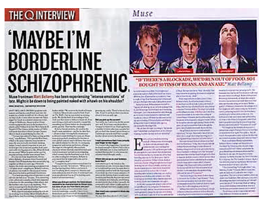
Q Muse Double Page Spread
As I have already analysed the cover, contents page of Q 279, i have a (very bad) copy of the article to analyse for consistencies.
Click here to view the original front page
Click Here For the original Contents Page

Click Here For the Mind Map
Layout/ Text
To begin with, there is a definite consistency within this page in comparison to the content’s and cover page. Again the layout is very neat and easy on the eye, it’s a very newspaper layout and this is what makes it more official and something more believable. We can see that this page is split into various sections. We can see the ‘Q interview’ banner is very cut but very effective and really adds an effect, if this wasn’t on the page It would be very dull and boring. So this really creates the magazine effect. Underneath this we can see very large capital font, this is clearly quote, the reasoning for this quote is a preview of the interview and it gives the reader an almost summary type of thing to what the article is going to cover. What you will find with most quotes is that they aren’t simple, plain boring or basic otherwise it gives a boring overview. This is used as the heading, normally the heading would be ‘muse interview’ but this is just as good of a replacement. Next thing I will be talking about is the subheading, we can that its covering Matt coming clean about everything, and this is relevant to the front cover, so again this is consistency and relevance. A very vital element when having a main feature…
The next thing I noticed in the layout is a very obvious interview layout, the questions are indicated by a bold font and normal font underneath, very basic but very easy to differ what text is which. However, the interview doesn’t start straight away, in any magazine you will read there is a summary of what the article is about and a summary of the band and history which will be relevant to the article. Everything will be relevant!
The colour scheme is the main consistency, we can see throughout all the Q pages I have analysed so far is the same colour scheme, red, white, black and hints of grey. This gives the mind linkage, we see Matt dressed in black white and grey, we look on this page and easily recognise this is what was on the front cover. If you don’t know what artist you’re reading about, this makes it easily recognisable and looks great. Shows that the magazine can carry on.
What I have noticed about the image is that they are the same images throughout, it’s from the same photo shoot and from the same place. Repeating my point, this gives consistency, however if you think about it, it would be confusing seeing different pictures of the same artists in completely different places dressed completely irrelevant to what he article is about, it doesn’t seem very organised.
Identity
There is a lot of identity within this image, Identity as mentioned before is part of the gratification theory. We can see from the image, that the band are very independent and this is relevant to the aspect of the indie style. People look up to muse so seeing them being honest and showing who they really are, and images of who they are i.e. being independent this gives them good press.
Information is the most important part regarding a magazine article as the main purpose is to inform the reader; this again is part of the gratification theory as people want to know the latest to keep up and follow the crowed. An important part of creating an article is not to go off of topic, for example when writing about muse it wouldn’t be appropriate to say ‘they’re going on tour with Justin Bieber’ then write a massive article about Kanye west. Not only do pictures and colour has to be consistent, in comparison to the article the colours are irrelevant.
Click here to view the original front page
Click Here For the original Contents Page
Click Here For the Mind Map
Layout/ Text
To begin with, there is a definite consistency within this page in comparison to the content’s and cover page. Again the layout is very neat and easy on the eye, it’s a very newspaper layout and this is what makes it more official and something more believable. We can see that this page is split into various sections. We can see the ‘Q interview’ banner is very cut but very effective and really adds an effect, if this wasn’t on the page It would be very dull and boring. So this really creates the magazine effect. Underneath this we can see very large capital font, this is clearly quote, the reasoning for this quote is a preview of the interview and it gives the reader an almost summary type of thing to what the article is going to cover. What you will find with most quotes is that they aren’t simple, plain boring or basic otherwise it gives a boring overview. This is used as the heading, normally the heading would be ‘muse interview’ but this is just as good of a replacement. Next thing I will be talking about is the subheading, we can that its covering Matt coming clean about everything, and this is relevant to the front cover, so again this is consistency and relevance. A very vital element when having a main feature…
The next thing I noticed in the layout is a very obvious interview layout, the questions are indicated by a bold font and normal font underneath, very basic but very easy to differ what text is which. However, the interview doesn’t start straight away, in any magazine you will read there is a summary of what the article is about and a summary of the band and history which will be relevant to the article. Everything will be relevant!
The colour scheme is the main consistency, we can see throughout all the Q pages I have analysed so far is the same colour scheme, red, white, black and hints of grey. This gives the mind linkage, we see Matt dressed in black white and grey, we look on this page and easily recognise this is what was on the front cover. If you don’t know what artist you’re reading about, this makes it easily recognisable and looks great. Shows that the magazine can carry on.
What I have noticed about the image is that they are the same images throughout, it’s from the same photo shoot and from the same place. Repeating my point, this gives consistency, however if you think about it, it would be confusing seeing different pictures of the same artists in completely different places dressed completely irrelevant to what he article is about, it doesn’t seem very organised.
Identity
There is a lot of identity within this image, Identity as mentioned before is part of the gratification theory. We can see from the image, that the band are very independent and this is relevant to the aspect of the indie style. People look up to muse so seeing them being honest and showing who they really are, and images of who they are i.e. being independent this gives them good press.
Information is the most important part regarding a magazine article as the main purpose is to inform the reader; this again is part of the gratification theory as people want to know the latest to keep up and follow the crowed. An important part of creating an article is not to go off of topic, for example when writing about muse it wouldn’t be appropriate to say ‘they’re going on tour with Justin Bieber’ then write a massive article about Kanye west. Not only do pictures and colour has to be consistent, in comparison to the article the colours are irrelevant.
Subscribe to:
Comments (Atom)