Click here to view the original front page
Click Here For the original Contents Page
Click Here For the Mind Map
Layout/ Text
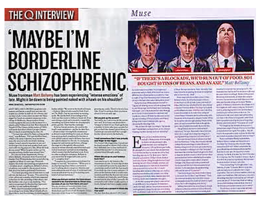
To begin with, there is a definite consistency within this page in comparison to the content’s and cover page. Again the layout is very neat and easy on the eye, it’s a very newspaper layout and this is what makes it more official and something more believable. We can see that this page is split into various sections. We can see the ‘Q interview’ banner is very cut but very effective and really adds an effect, if this wasn’t on the page It would be very dull and boring. So this really creates the magazine effect. Underneath this we can see very large capital font, this is clearly quote, the reasoning for this quote is a preview of the interview and it gives the reader an almost summary type of thing to what the article is going to cover. What you will find with most quotes is that they aren’t simple, plain boring or basic otherwise it gives a boring overview. This is used as the heading, normally the heading would be ‘muse interview’ but this is just as good of a replacement. Next thing I will be talking about is the subheading, we can that its covering Matt coming clean about everything, and this is relevant to the front cover, so again this is consistency and relevance. A very vital element when having a main feature…
The next thing I noticed in the layout is a very obvious interview layout, the questions are indicated by a bold font and normal font underneath, very basic but very easy to differ what text is which. However, the interview doesn’t start straight away, in any magazine you will read there is a summary of what the article is about and a summary of the band and history which will be relevant to the article. Everything will be relevant!
The colour scheme is the main consistency, we can see throughout all the Q pages I have analysed so far is the same colour scheme, red, white, black and hints of grey. This gives the mind linkage, we see Matt dressed in black white and grey, we look on this page and easily recognise this is what was on the front cover. If you don’t know what artist you’re reading about, this makes it easily recognisable and looks great. Shows that the magazine can carry on.
What I have noticed about the image is that they are the same images throughout, it’s from the same photo shoot and from the same place. Repeating my point, this gives consistency, however if you think about it, it would be confusing seeing different pictures of the same artists in completely different places dressed completely irrelevant to what he article is about, it doesn’t seem very organised.
Identity
There is a lot of identity within this image, Identity as mentioned before is part of the gratification theory. We can see from the image, that the band are very independent and this is relevant to the aspect of the indie style. People look up to muse so seeing them being honest and showing who they really are, and images of who they are i.e. being independent this gives them good press.
Information is the most important part regarding a magazine article as the main purpose is to inform the reader; this again is part of the gratification theory as people want to know the latest to keep up and follow the crowed. An important part of creating an article is not to go off of topic, for example when writing about muse it wouldn’t be appropriate to say ‘they’re going on tour with Justin Bieber’ then write a massive article about Kanye west. Not only do pictures and colour has to be consistent, in comparison to the article the colours are irrelevant.
No comments:
Post a Comment